Aivia Software
Violin plot
- Holger Fehlauer
- Won Yung Choi
Violin Plot is one of the charting options available in the Charts Panel. It displays the probability density function of one measurement for different object sets/groups. Additionally, it calculates and displays the significance of the mean values across object sets/groups according to Welch's t-test.
To display the Violin plot, open the Charts Panel and select the Violin plot option  from the Charts selection dropdown menu.
For detailed information, please refer to the Wikipedia entry for Violin plot, Box Plot and Welch's t-test.
On this page:
Appearance
Probability density function
Probability density functions are displayed along a central axis for each object set/group possessing the measurement displayed on the y-axis. The probability density function is calculated by summing up individual distribution functions for the measurement of each object, given by a Gaussian distribution:
f(x;μ,σ) = e^(-1/2*((x-μ)/σ)^2) / (σ*(2*Pi)^(1/2)),
with μ being the measured value and σ (the approximated bandwidth) of:
σ = 1.06 * sd * n^(-1/5) / 2,
with sd being the standard deviation and n being the number of data points.
See the Wikipedia pages for Probability density function and Kernel density estimation for more information.
Swarm / Box and whisker plot
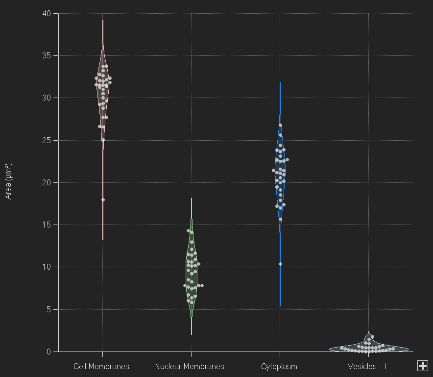
A swarm plot is overlaid if the number of objects per object set/group is equal to or less than 150. In this display, each point is an object within the object set.
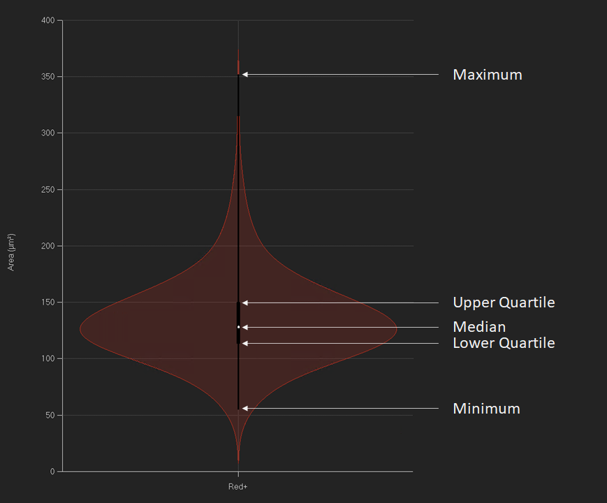
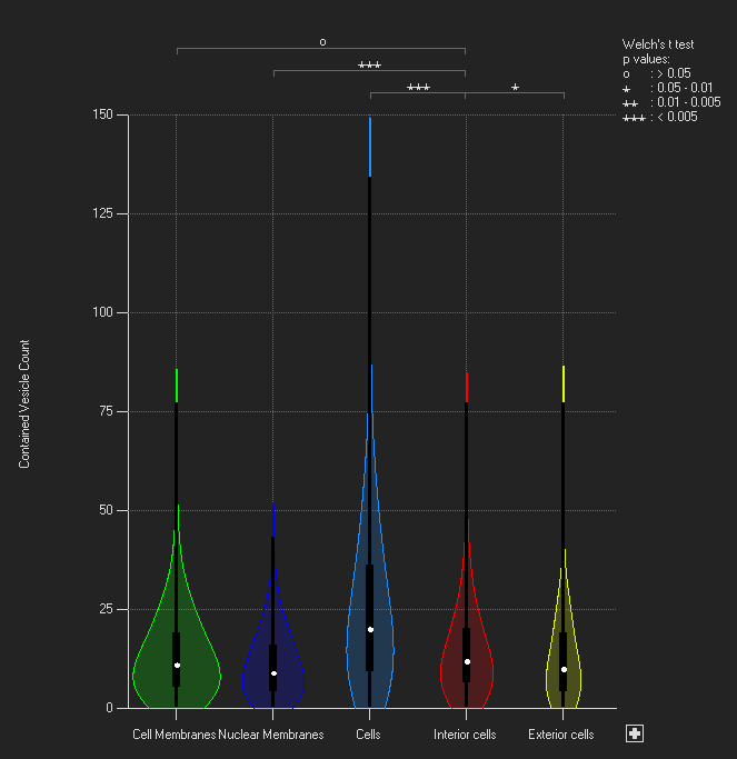
If the number of objects for any object set/group is greater than 150, a box and whisker plot is overlaid. Herein, 1) a point marks the median of all objects of an object set / group for the selected measurement, 2) a thicker box ranges from the top 25% of the data (upper quartile) to the lower 25% (lower quartile) - enclosing the central 50% and 3) a thinner line ranges from minimum to maximum (see image on the right).
The probability function is likely to exceed the minimum and maximum of the data, resulting in a colored bit extending over the line going from minimum to maximum. (See image on the right, above maximum)
Significance (Welch's t-test)
When hovering over a violin, the significance (p-value = probability that two mean values originate from the same sample) for that mean value towards the other mean values is displayed according to Welch's t-test and by a star-rating - legend on the right of the plot (image on the right):
- if the p value is greater than 0.05, the star rating is o
- if p is smaller than 0.05, but greater than 0.01, the star rating is *
- if p is smaller than 0.01, but greater than 0.005, the star rating is **
- if p is smaller than 0.005, the star rating is ***
When clicking on a violin, this violin's star ratings are displayed and locked. While locked, hovering above the stars will display the associated p-value. To release the lock, click anywhere else other than on a violin.
General usage
Select measurement
As with all charts, to select a measurement, hover over the measurement name (on the y-axis) until it turns red and then click to bring up a menu of the available measurements.
Select object sets/groups
To modify the object sets/groups that are displayed, hover above the object sets/groups names on the x-axis until they turn red and left click. This will bring up the menu of object sets/groups for you to select and unselect.
A plus-sign on the right of the x axis indicates additional object sets/groups which are currently not displayed. To add these object sets/groups click the plus button and select the sets/groups you want. By default, the number of object sets/groups displayed is fixed, depending on the size of the chart panel, but will be changed automatically if more object sets/groups are selected.
Y-axis range
The range of the y-axis may be changed by clicking on the minimum/maximum tick label and type in a new minimum/maximum. The range may be reset by clicking the reset chart axes button.
Context menu options
You can bring up the context menu by right-clicking anywhere in the Charts Panel. The context menu is specific to the Violin plot and can be used to adjust chart display options.
| Name | Description |
|---|---|
| Normalize individually | When turned on, each violin will be normalized individually according to its maximum. When turned off, each violin will be normalized by the global maximum of all violins. |
| Two-sided violin | This option allows to display a second measurement for all object sets / subsets on a second y-axis (on the right of the chart). Violins will be split in half, with the left half belonging to the measurement on the left y-axis and the right half belonging to the measurement on the right y-axis. For all violins median, maximum, minimum, upper and lower quartile will be shown for both measurements individually. For mouse over, significance values and mean +/- sd will be displayed for that half-violin the mouse is hovering above, towards the mean of the same measurement of all other displayed object sets / subsets (see image on the right). |
| Update during play | With this option selected the Violin plot will update to display the current frame when playing an image sequence. If deselected, the chart will update during single frame navigation, but will not update while playing an image sequence until the sequence is paused. |
|
|---|
Violin + swarm plot |
|
|---|
| Violin + box and whisker plot |
|
|---|
| Violin plot with significance (star rating) comparing mean value of "Interior cells" with the others: "Interior cells" vs. "Cell Membranes": no significance, "Interior cells" vs. "Exterior cells": low significance, "Interior cells" vs. "Nuclear Membranes" and "Interior cells" vs. "Cells": high significance. |
|
|---|
| Two-sided violin plot (normalized) with significance (star rating) for second measurement (Mean Intensity - CD3) of Cluster 4 towards all other object sets. |
