Aivia Software
How to auto-classify objects and visualize them
- gordon
- Won Yung Choi
Create a classifier
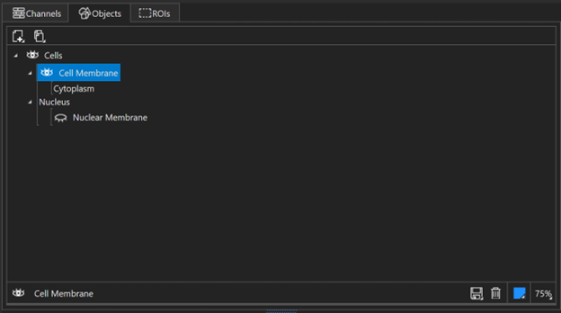
Once the Multiplexed Cell Detection tutorial has been completed, in the Object explorer an object tree will appear with Cells and their associated components. These objects are will also be present on the image displayed We will be running the object classifier on these objects.
To create an automatic object classifier, navigate to the Object Classifier panel. Create a new classifier by clicking on the Create new classifier
 icon. This will open the classifier creation window:
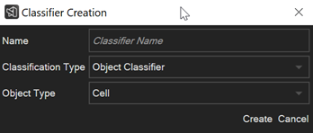
Type in a name for your classifier. This will be used as the name of the classifier in the classifier selection drop-down menu, and will be the default filename when the classifier is saved as a file. We will name our classifier “Demo.”
From the drop down menu for Classification Type, select Automatic Classifier.
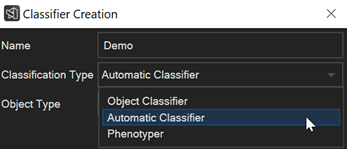
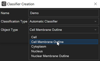
For this demo, we will be classifying cells by their contents, or namely the area contained by the Cell Membrane Outline, which contains the Cytoplasm Object, as previously observed in our Object explorer panel. Press Create when complete.
The Object Classifier panel should now have two separate subpanels present in the window, Measure and Cluster. In the Measure panel, you will select the measurements you want to characterize each cell’s contents. Under the Measurements drop-down menu, there are two options (1) Standard and (2) Custom. By default it should be set to Standard. Click on Standard if not already selected, and under Input Channels select all channels.
Under the Cluster panel, select PhenoGraph-Leiden under Clustering Type. For this demo, we will be running with default parameters.
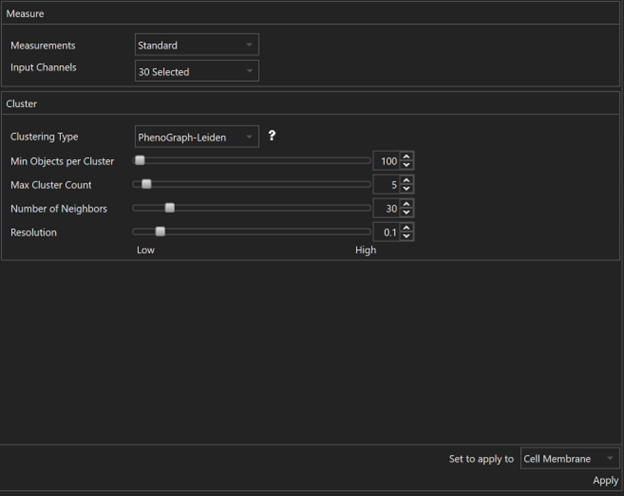
To apply the classifier, make sure the drop-down menu next to Set to apply to is set to Cell Membrane. If there are multiple Cell Membrane objects in the Object explorer, this will allow for the classifier to be applied to different Cell Membrane structures. Note however that this classifier can only be applied to Cell Membrane types, as it was configured earlier in this tutorial. Press Apply to run the classifier. A progress bar should appear on screen.
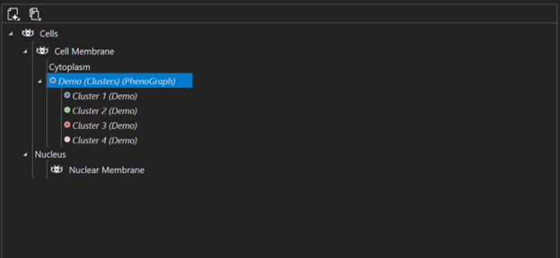
Once the classifier is done running, there will be a new Clusters object containing the classified cells in the Object explorer, nested under Cell Membrane. For this demonstration, the object classifier has classified the cell objects in the image into four different clusters.
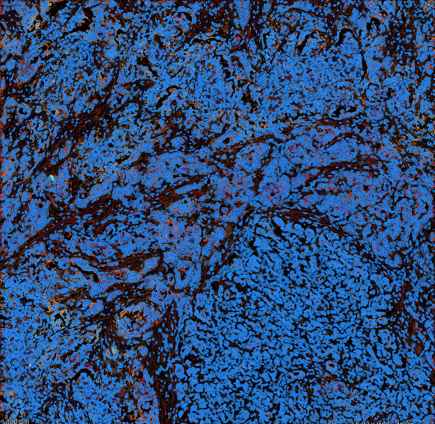 |
Image with cell nuclei and boundaries |
 |
Object Explorer window |
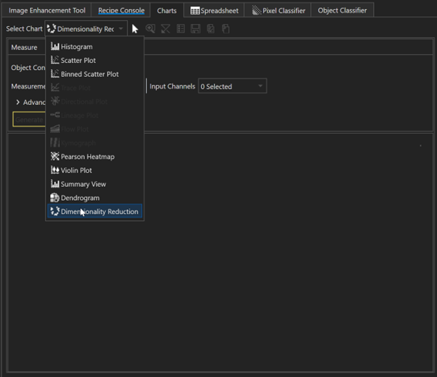
Visualization using Dimensionality Reduction
When the object classifier clustered the cells, it incorporated all the data from 30 channels for each cell to determine which cluster each cell should belong to. To visualize this data in a lower dimensional representation, we will utilize the Dimensionality Reduction tool under Charts to visualize the individual clusters. Under the Charts tab, select Dimensionality Reduction under the Select Chart drop-down menu.
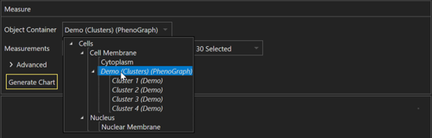
This will open a panel called Measure. To plot the clusters in 2D space from their 30-dimensional space, we will need to select the appropriate set of clusters to plot. Under Object Container, select the clustering generated from the previous steps.
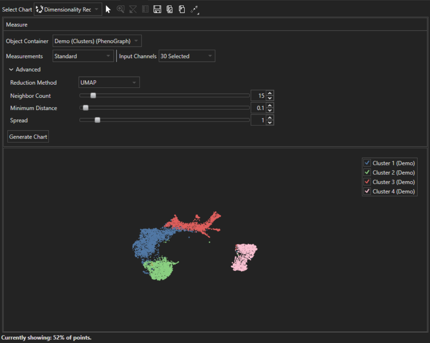
Set Measurements to Standard via the drop-down menu, and for Input Channels, select all channels. You do not necessarily need to select the same channels that were used by the Object Classifier for classification and can select a subset of channels if desired.
To select the dimensionality reduction method, click on the caret next to Advanced. This will open additional settings, where you can select the Reduction Method and tune parameters specific for each Reduction Method. By default, Reduction Method is set to UMAP. For this demonstration, we will be running UMAP under its default parameter values. Press Generate Chart to create the chart. Once AIVIA is done calculating, the chart will appear beneath the Measure panel in a new panel of its own. Clicking on any of the colored clusters will highlight the respective cells in the main image panel.
Visualization of clustering confidence
- When the object classifier clustered the cells, it simultaneously assigns a clustering confidence score for each cell clustered. This confidence score provides context to how well associated each cell is with its respective cluster. More information on the score can be found at Automatic Object Classifier.
- The value for each cell's associated confidence score can be found under
Spreadsheet, where in addition to various single cell measurements you can find a cluster assignment number and its associated confidence score:
On the far right end of this table, the Cluster number (as an integer, 1,2,3...etc.) can be found. The confidence score in the following column corresponds to each cell's cluster assignment. - One way to examine which cells are strongly associated with their assigned cluster is to use the charts tool. By setting the y-axis to the confidence score, and the x-axis to cluster number, you can visualize the dispersion of clustering scores for each cluster:

- By clicking and dragging across different areas of the scatter plot, you can then select points that are above a certain confidence threshold, and observe where they are located on the input image. In the example below, we have selected for cells in cluster 2 with a confidence score of greater than 0.6:

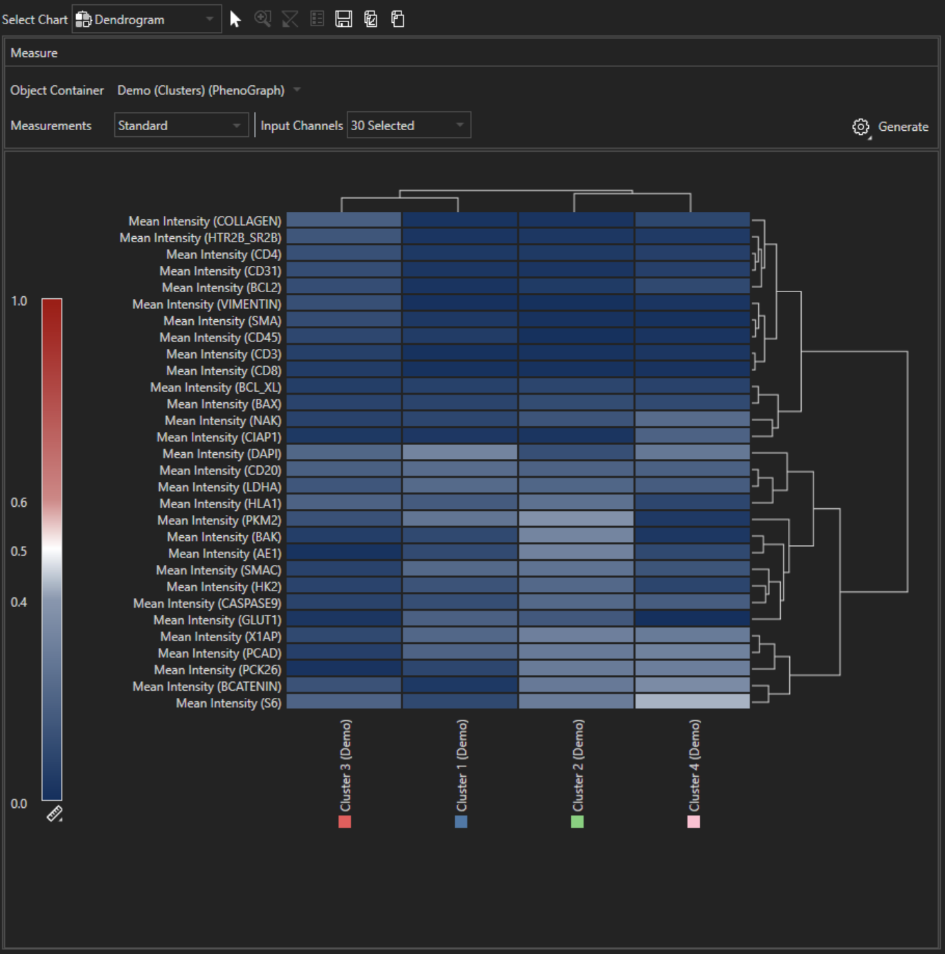
Visualization using Dendrogram
- While the Dimensionality Reduction chart can give an approximate idea as to how related each cluster is, it does not provide specific information on how each of the cells in each cluster differ with respect to the 30 input channels selected previously. A better chart to use for this case would be the Dendrogram chart. To select the dendrogram chart, change the chart to Dendrogram under Select Chart, where we had previously selected Dimensionality Reduction.
- Like before, make sure the Object Container selected are the clusters we generated previously. Under Measurements, select Standard, and under Input Channels, select all. Click on Generate to produce the Dendrogram chart.
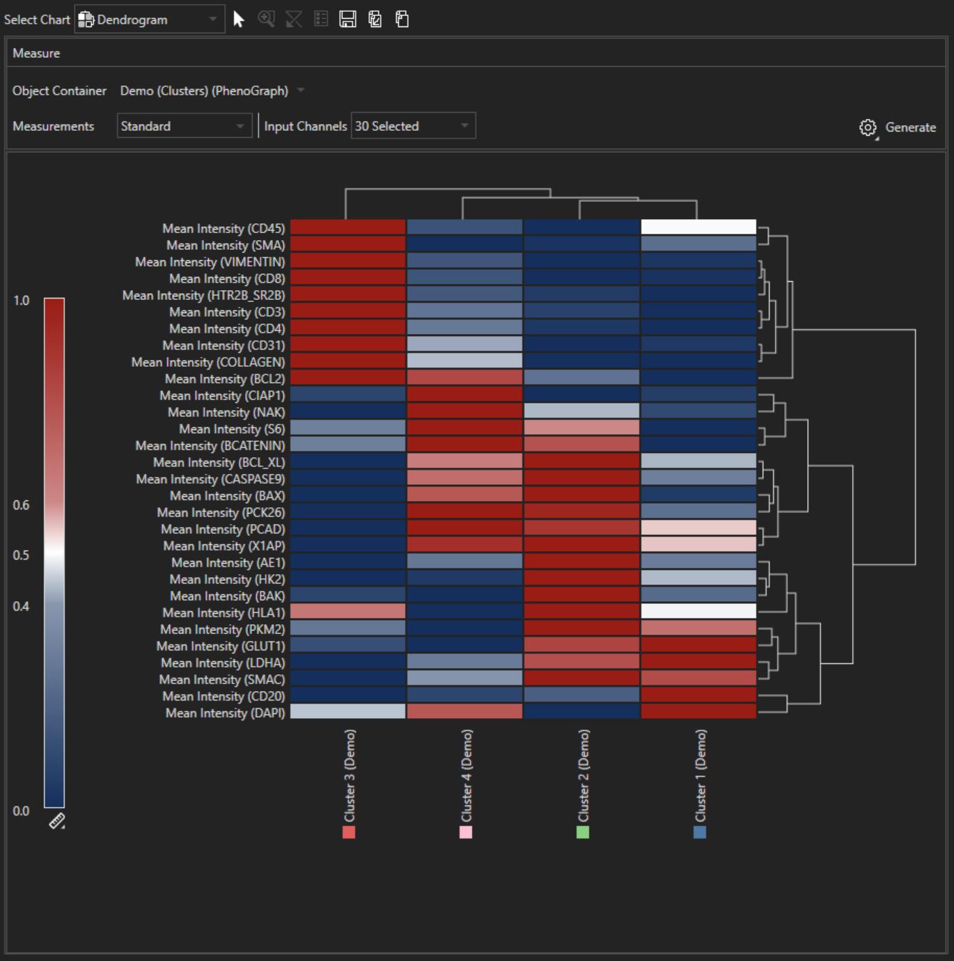
- If desire, the heatmap can be used to display the raw values measured. Click on the Gear icon next to Generate and select Plot Raw Data